
The Buffalo Sabres have played in the NHL since 1970. Unlike some teams who have maintained a traditional jersey over the decades, the Sabres are famous (and sometimes infamous) for their different jerseys, logos, and re-designs. This means that there are lots of different options for custom Buffalo Sabres jerseys depending on which era of Sabres history you’d most like to remember.
The inaugural season of the Sabres famously debuted their royal blue with gold trim jerseys, boasting a sharp, clean aesthetic that reflected the team name, the weapons used by royal guards throughout European history. The 1970s were a strong decade for the Sabres: they made the playoffs all but three times (three of their first four years in the league), while their French Connection top line of Gilbert Perreault (member of the Hockey Hall of Fame), Rick Martin, and Rene Robert helped propel them to success. The Sabres would reach the Stanley Cup finals in 1975, only to lose to the Philadelphia Flyers.
The 1980s saw only minor changes to the uniform, casting away the lace-tie neckline in favor of a V-neck, adding the teams crest onto the shoulders as well as the front, and thickening the stripes at the base of the jersey. While the Sabres made the playoffs consistently throughout the 1980s, they only made it out of the first round three times.
The 1990s saw major changes to many NHL uniforms and the Sabres were no exception. In 1995 the team announced they would close their old barn, Buffalo Memorial Auditorium, and move to the Marine Midland Arena. With new digs came a new uniform and color scheme. The Sabres adopted a red and black jersey featuring a buffalo-head logo and shoulder patches with a sword slicing through a giant B. No shortage of hockey fans, including Sbares fans, criticized the new look replacing a classic, but many more fans remember this kit as the Dominik Hasek era, when Buffalo’s best player in history took the team all the way to the 1999 Cup Final, although they came away shorthanded to the Dallas Stars. The Sabres also introduced an alternate jersey, an all-red “dinner plate” with two crossed swords for the center crest and a BUFFALO wordmark on the bottom rim.
With the 2005 NHL lockout came more changes. The Sabres introduced the (in)famous Buffaslug, a logo of a buffalo that bizarrely had no legs. Fans didn’t mind: the new-look Sabres were some of the best in franchise history, winning 50 games and appearing in two consecutive Conference Finals, although they failed to reach the Cup Finals.
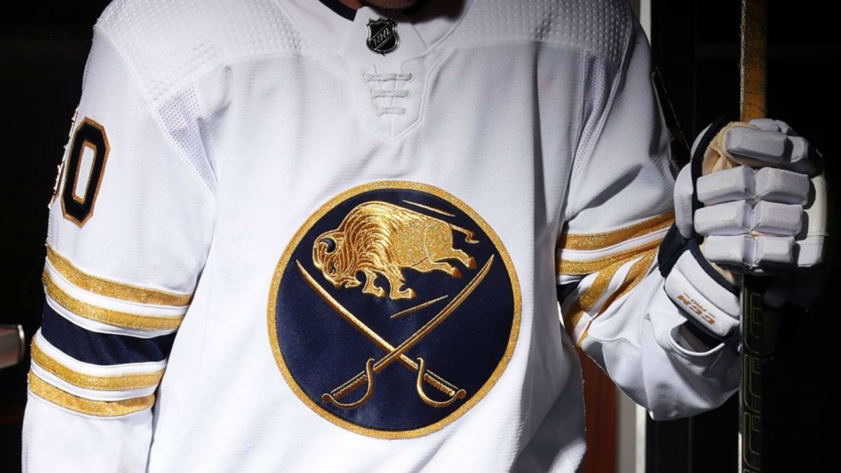
In 2008, the custom Buffalo Sabres jerseys gave the fans what they wanted and switched back to a design based on the original jerseys: the same royal coloration, same original logo, and same base lines. However, the Sabres have been stuck in mediocrity since returning to their original designs, suggesting that tradition may not be the best route to success.